Scotland’s Cruise Centre
Introduction
How do you rebuild a global cruise platform that serves an industry of 30 million customers annually? What does it look like to reinvent a product experience and streamline checkout features? How do you find and then communicate to the 17.8 million customers entering the market each decade?
Where would you even begin?
The following case study is an in-depth analysis of my role performing user research, creating user personas, ideating new features, creating task flows, prototyping, & visual design for Scotland's Cruise Centre.

UX Redesign, Personas, & Architecture
Overview & Background
Client
Scotland Cruise Centre, founded in 1972, has been booking world-class vacations for over 40 years. They are recognized for their experience, customer dedication, expertise with international destinations, airlines, and hotels to deliver a personalized cruise experience exceeding customer's expectations.
Role
Product Designer
Art Direction, Information Architecture, Interactions, Interface Design, Prototyping, User Research, Visual
Time Length
1 month to launch
Team Members
Bryan Holbrook
Problems & Opportunities
User Experience
Usability - Registration journey too complex requiring a simplified process, with more intuitive steps. UI design, navigation, architecture, and visual experience complicated and confusing.
Business - Poor performance leading to lost revenue and reduced customer base. The platform misunderstands the customer's needs leading to mental gaps from an overly complex UI.
Customer Research - The customer base has changed—becoming more complex and varied with new requirements of how they interact with companies and sales teams. This includes customer expectations of the brand and technological relevance, performance, i.e. ease of use has become a problem.
Project Goals
Customer - Discover nuances in the customer base in order to communicate effectively and make sure that business goals and user goals are in alignment.
Product - Redesign cruise form experience to increase conversion and reduce time-out based on customer's mental model and expectations.
Content - Redefine content and site to more closely align with users' expectations in terms of product pairing, offerings, and modern software performance.
Test - Build a functioning prototype in order to prove assumptions through testing pre-development to receive user feedback.

“Live in the sunshine, swim the sea, drink the wild air…”
— Ralph Waldo Emerson
Process
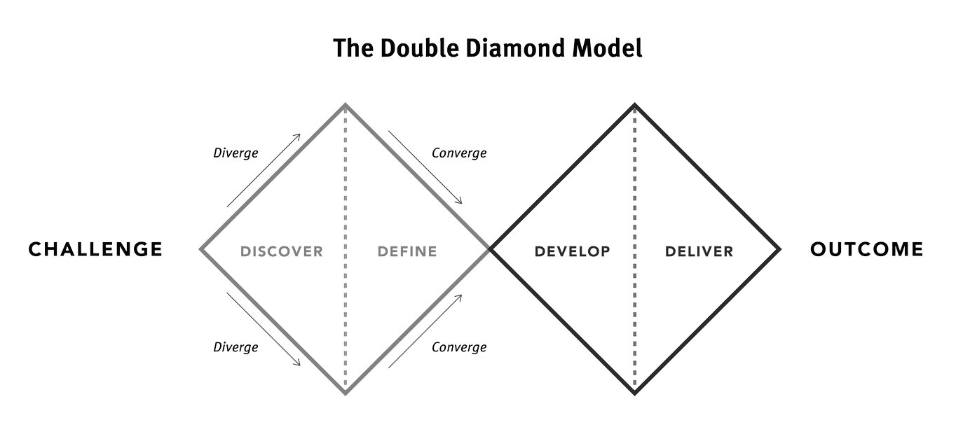
S.M.A.R.T. method for defining KPIs, Double Diamond Theory for discovery, and Lean UX Process for an agile workflow to aid in discovery and communication. These processes help discover as many unknowns as possible while also maintaining clear channels of communication between product teams, project management, and directors when measuring the performance of our proposed goals.
Discover: Understanding the Problem
This was not necessarily a 'blue sky' discovery project. When I began the client had clear business goals and user goals as well as some initial assumptions regarding how they believed their customers currently performed that they wanted to be tested on top of the task of fixing their current usability issues.
This was great news.
By defining a baseline of where we were, at least where we thought we were, I could track progress against these initial assumptions and goals through my research while refining the questions based on what I found. Then I could combine my newly discovered data with their initial assumptions to provide a brand new solution all while using the companies goals in mind to serve as my true north.
Original
Redesign
Business Goals (pre-discovery)
Primary Goal: Increase Summer cruise purchases, May-September by 15%.
Secondary Goal: Increase Pre-order cruise purchases for the following year by 10%.
User Goals (pre-discovery)
Primary Goal: Research cruise prices, amenities, dates, and destinations.
Secondary Goal: Check-out online.
I had just one month to define the customer, usability issues, as well as create tasks in order to test their performance over the Summer period to than use as our baseline to refine for the following year.
I began with the business goals by applying the S.M.A.R.T method to the main landing page of the website since it is the highest-trafficked page on the site. I then created a list of trackable elements on the home page that we could use to influence conversion and created a series of test around which are the following:
Business Goal Tests (pre-discovery)
Home carousel and banner ad click-through
Purchase rate of particular cruise types & destinations
Image types i.e. imagery with people, imagery of the destination, imagery of the boat itself
Adjusting lower-performing ads to match the higher-performing ad then repeat
Click events including mouse hover
Time on page
Test length, 1 week per test. Noting the time, day and season to create engagement baseline.
Define: User-Personas & Understanding Customer Types
Discovering The UserBefore I could brainstorm solutions affecting users' ability to research cruise types and check-out, I needed to first understand the scope of the problem by defining the current impact on the user. In order to do that I needed to know who the user was to accurately measure the impact.
I began compiling user data based on market research, pulling publicly available purchase data of the cruise industry from Statista, major cruise publications, and blending it with our current assumptions of our customers, to then define a baseline of age, household income, cruise frequency, spending habits, and technical fluency to produce customer profiles for the company in the form of three distinct user-personas.
Architecture & Navigation
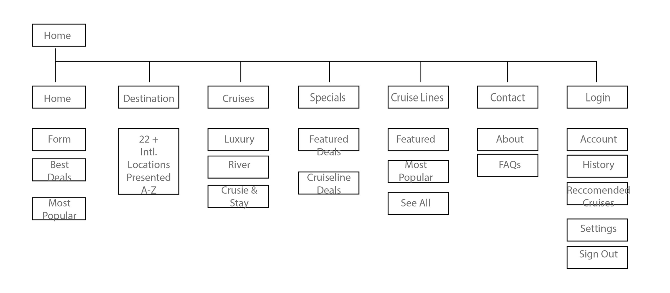
Before the design of the UI could begin a content analysis of Scotland’s Cruise Centre website needed to take place. Once completed all the information was then compiled into a content inventory to find places of improvement, areas of content to edit and delete as well as ways of regrouping content based on better mental models.
Research of the cruise line industry continued by reviewing competitor websites like Royal Caribbean, Princess Cruises, Cruise.com, Carnival Cruises to help define the current state of our product by comparison to others in our market. At the same time keeping in mind the nuances of our users in the market. Remaining sympathetic to their unique needs and demands.
Needs such as search and findability ease based on common phrasing, speech, and linguistics inside Scotland. Keeping in mind that Scotlands Cruise Centre website is an aggregator of cruise deals and therefore must lend itself to ease of use by coherently grouping deals and cruise line information based on the users logic and their mental model of the site’s information architecture.
Current state to future state modeling. Lo to hi-fidelity research. User flows, navigation notes, & content analysis.Tasks List
Select a cruise from a link
Review cruise featured, monthly, yearly, specials
Find out cruise destinations
Review available cruises
Find cruise lines affiliated with the site
Contact the site for help, FAQs
Book a cruise through the search form
Read the sites about page
Compare other cruises to search results
Log in to account and review the personal history
Search Website
View Site map
View social sites
View news about cruises affiliated with the website
Task Flows (lite): Exploratory and Goal Specific
Book a Cruise: Goal-Oriented User Task
Land on home page
Review available cruises, monthly, yearly, specials
Select featured cruise
Search cruise destinations
Review dates available
Select date
Book cruise
Forced account creation to check out
General Search: Exploratory User Task
Land on home page
Search website
Select about page
Select FAQs for help
View Site map
View social links for content
View news about cruises affiliated with the website
Find cruise lines affiliated with the site
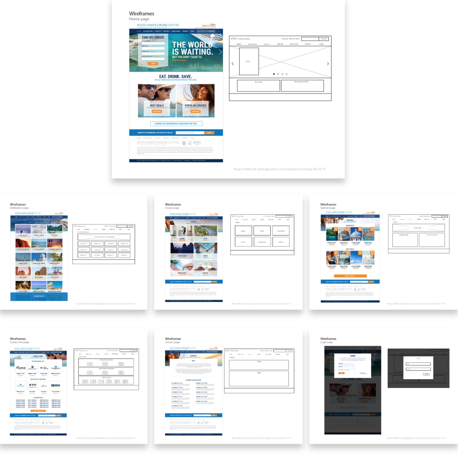
Wireframes
Visual Language:
Typeface: Roboto, to comfortably scale across browsers.
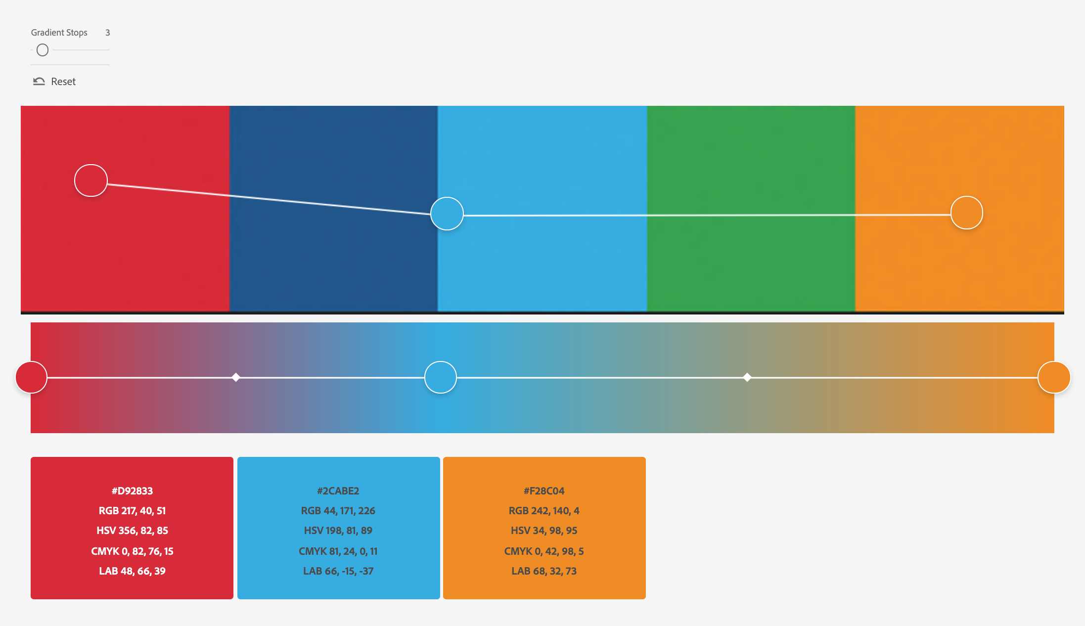
Color Palette: Scotland Cruise Centre's primary, secondary, and tertiary colors for logo use, type callouts and CTAs, backgrounds, and overlays including additional interactive elements.
Photography: Natural lighting of happy families, couples, cruise ships, and international destinations.
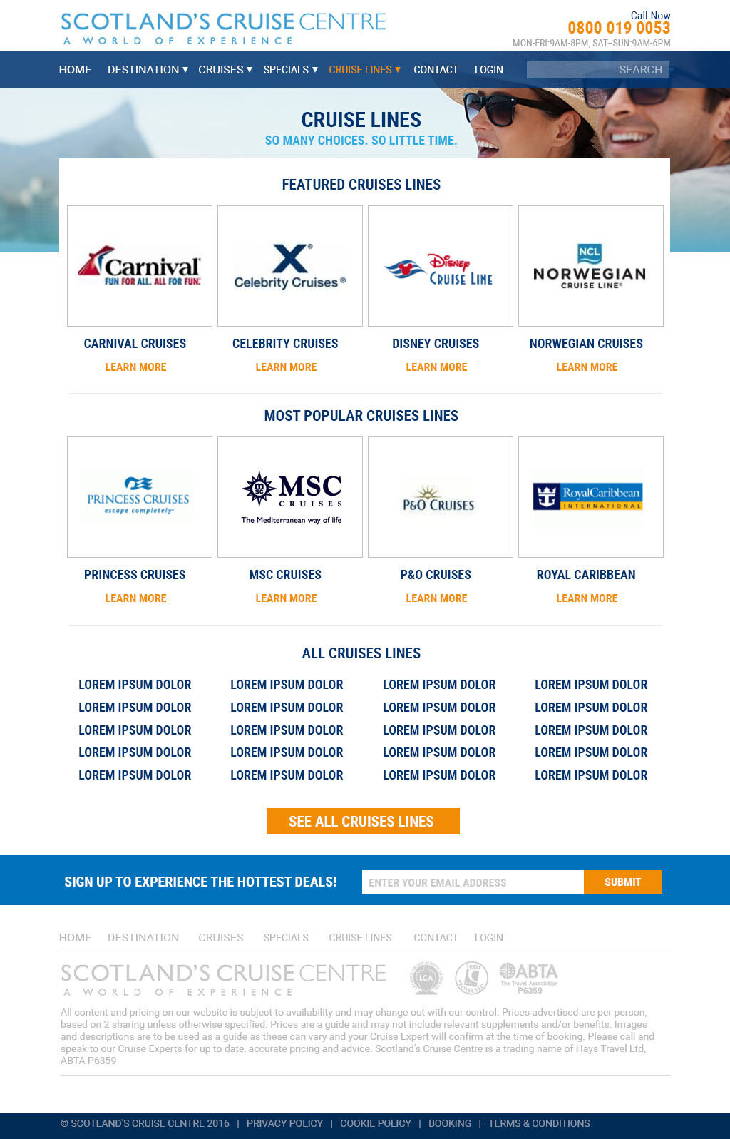
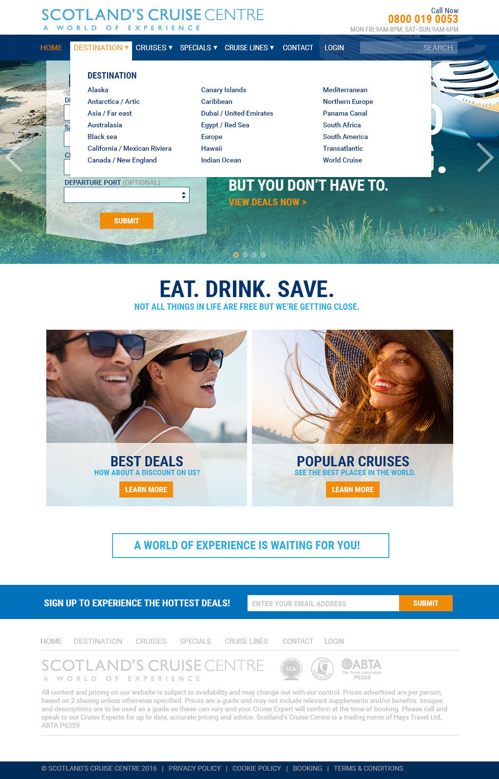
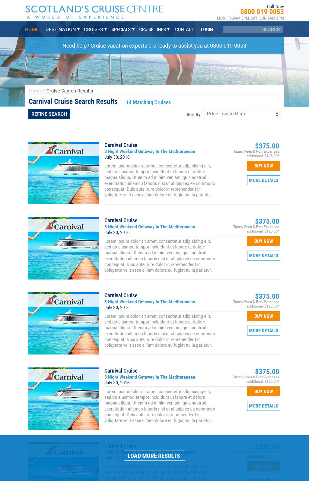
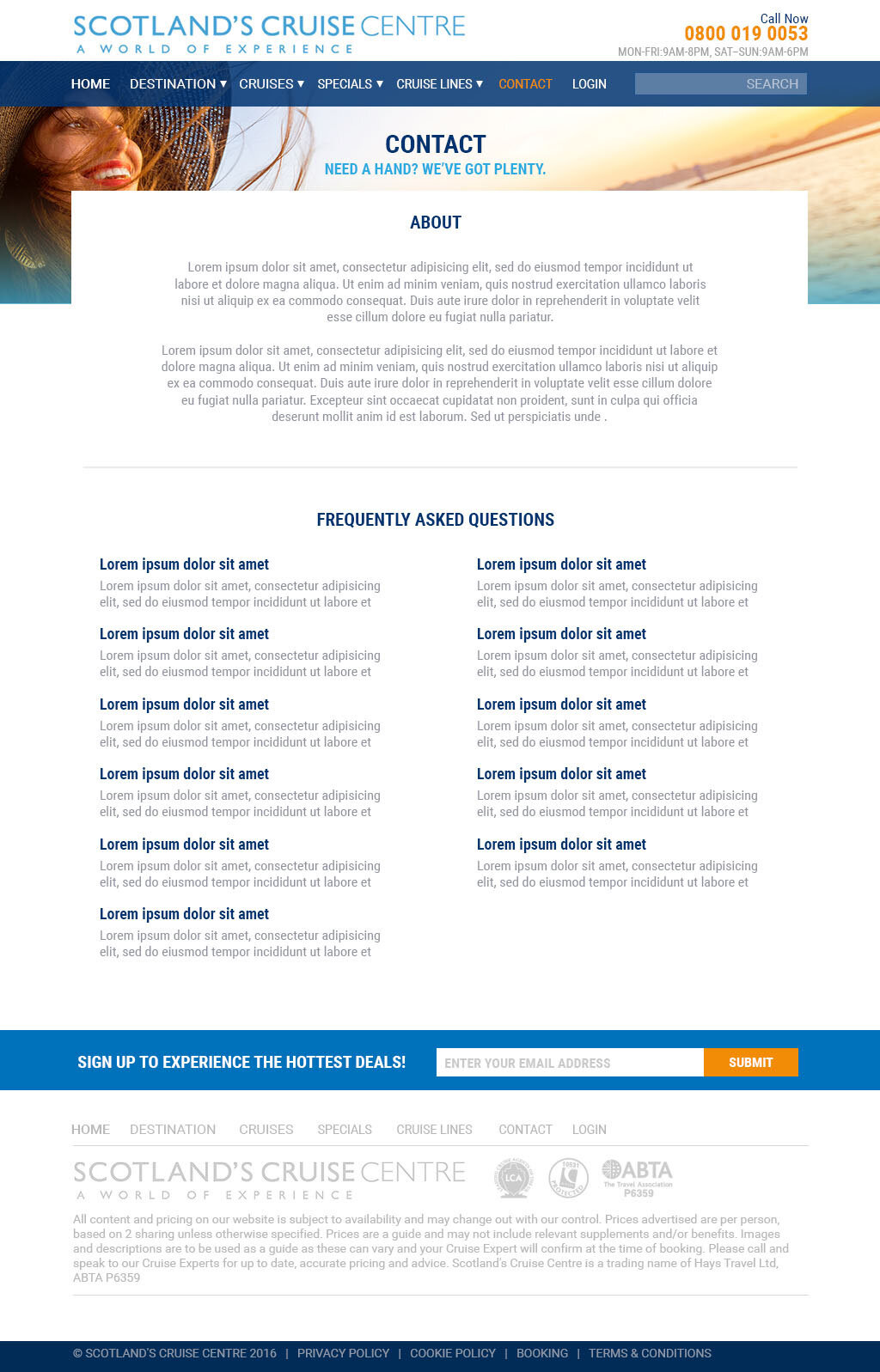
Visual Language Applied to Wireframes
Hi Fidelity Mockups




Develop: Prototyping Solutions
With all of my research combined into hi-fidelity mockups approved for the client, I was in a position to build a quick prototype for engineering before we began. This allowed us to see the site in action without having to commit any major engineering time to the build until we knew it was confirmed for production.
Scotland Cruise Centre Prototype
Delivery: Final Handoff
Serving as UX researcher and product designer, I packaged all of my artifacts and delivered them for approval.
UX artifacts included:
User-personas
Information Architecture & New Content Strategy
Wireframes & Task Flows
Prototype built-in Invision
New Visual Design
Launch
By verifying common roadblocks to users and providing alternate solutions to the issues disrupting the user journey when completing the form, such as complexity, I was able to close newly discovered gaps to business performance affecting customer growth, retention, and revenue from blocks at check-out. Research, problem-solving, and visual language can be seen on the site today.
Improvements include:
New super navigation
Updated site architecture, & content structure.
Improved button sizing and simple registration form
Updated visual language and photography
Results: Key Take-Aways
Since implementation, a decrease in error rates from registration, navigation events, and generalized searches coming through customer service can be inferred from the design including general positive feedback from improved UI and visual design by offering a simplified design for users. Additionally, considerable amounts of time through error rate reduction have been returned to the user by alleviating previous roadblocks in the check-out service including, aiding in actualized revenue by providing a reimagined check-out experience.
Key takeaways:
Immediate Results: Increased site engagement through reduced complexity on the home page, simplified CTAs leading to uptick in click events, improved perception through 'designed' experience.
User Testing: Constant iteration will be necessary to fix newly introduced issues from the previous update. The newest design has revealed a new stall-out section in checkout requiring a phone call to confirm orders. This is not necessarily an issue if the desired outcome is to force a call with customer service for consumer protection, validation, and up-selling. At the moment, as a user, I have to assume a great deal as to why the website does not allow me to check-out online on the user journey which leads to confusion and additional steps to completion.
Engineering: Simplified and intuitive designs lead to reduced engineering hours being spent on front-end tasks trying to figure out what's wrong with the current design and allowing engineers to spend more time handling data flow, filtering, and security.


