Franklin Covey
21st Century Leadership
Introduction
What does it take to bring an iconic business leadership company into the 21st century?
A new SaaS platform? A corporate rebrand? Precise analytics? Best-selling books? A podcast with today's leaders? A custom website for 160+ international partners? Thousands of global events? Standardizing systems, communication, and design? Growth campaigns and automation reaching millions annually?
The answer is all of this and so much more.

Corporate Rebrand & International Site Design
Overview & Background
Client
FranklinCovey is the world leader in helping organizations and individuals achieve business, leadership, and personal effectiveness goals through behavioral change. They achieve this goal by providing support in solving difficult challenges of leadership, productivity, time management, execution, sales performance, and trust.
Behavioral change solutions are delivered as business content, tools, methodologies, digital and in-person training, and thought leadership backed by research and proven practices.
Role
Product Designer
Art Direction, Design Systems, Information Architecture, Interface Design, Prototyping, Site Interactions, Testing, User Research, Visual Design
Time Length
3 months to launch (optimization ongoing)
Team Members
Bryan Holbrook
Problems & Opportunities
Brand
Awareness - Brand is outdated and disjointed from neglect, lacking a modern relatable look, and cohesion. No brand recognition.
Operations - US teams are fractured, creating products in silos with limited to no communication with others in direct offices. This dislocation extends equally to international partners through brand inconsistency.
Business - Failure to capture emerging market based on an amorphous and unrelatable brand leading to lost revenue.
International Corporate Website
Awareness - 160+ global partners do not have a website or have built their own independent of corporate leading to wide inconsistency.
Operations - US communication is infrequent regarding digital experience globally.
Usability - International sites created independent of corporate direction leading to inconsistency in performance, design, and experience.
Business - Global partners lacking digital presence have drastically reduced opportunities to create awareness, customer trust, & revenue.
Project Goals
Stabilize - Stabilize FranklinCovey's brand through a site redesign that merges legacy identity, themes, and philosophy with updated visual language.
Unify - Unify FranklinCovey's global presence digitally and operationally by providing 160+ international offices with a redesigned, mobile-first, localization-ready, corporate website.
Extend - Extend refined brand language following testing into the US website. Update remaining and emerging US digital properties.
Enhance - Enhance website, brand, and digital products through continuous testing, user feedback, and analytics to evolve product offerings over time into the future. (Ideate. Implement. Test. Repeat.)
“Educating the mind without educating the heart is no education at all.”
— Aristotle
Process
When designing products specifically and solving problems generally, I commonly implement the Double Diamond Theory and Lean UX process.
I find it to be one of the most effective models for discovery considering that people naturally grasp its logic intuitively. This model also complements project manager and director goals which are commonly more focused on timeline, resources, and financials instead of product design.

Discover. Define. Develop. Deliver. and/or Discover. Define. Ideate. Launch.
Discover: Understanding the Problem
When I joined FranklinCovey's digital team a product rebuild, lite rebrand, and a new platform had just been selected. The platform that was chosen for the rebuild in 2016 was Adobe Experience Manager (AEM). From the outset, the new platform was proving to be problematic for the team.
The initial idea was that all corporate sites around the world would be controlled and maintained from the US instance of AEM, with all offices receiving local administrative credentials and authoring access in order to make updates in their region. Centralized control would then translate into global branding and digital consistency.
This was not the case.

Technical constraints, team size, usability, licensing, and engineering costs had not been fully understood—revealing a platform that was a great deal more than what was needed or could be supported.
Although AEM is an excellent enterprise solution used by many companies, it was designed for much larger teams with larger budgets and was not a good fit. This early discovery proved it would be too complex to launch in the next three months and too costly to maintain into the future.
The newly chosen platform had quickly become the problem instead of solving them and I now needed to come up with solutions for the following issues:
Research and finding a new platform that has international support that can be easily shared with our partners
Rebuild the website then replace the AEM version for international and then eventually in the US.

AEM Platform website
Researching Users Problems
Research In-Brief:
Discovering users’ technical abilities, needs, and goals through personal interviews and surveys.
Defining users' problems and uncovering pain points in the user journey.
Developing informed hypotheses to create lo-fi wireframes & prototype to get buy-in from stakeholders
Deliverables final form—researching what the final form would need to be including defining what the launch would look like, regarding assets, site implementation, support going forward, and determining success metrics to gauge performance. i.e. cost to the company, ease of use for administrators, and customer effect.
I began by conducting interviews with our primary users—site admins, digital directors, IT, account managers, accounting, international partners, customer support, customers—basically, anyone who was working on or would be working in or supporting the system, in order to uncover hidden issues that they were experiencing with this release to add to the list of customer concerns. This included taking platform training courses in AEM to serve as administrator, author, and engineer of the product in order to discover its current limitations.
Compiling Data
Following my user interviews, I created an affinity map to help uncover common themes, pain points, as well as discover areas of success to repeat and leverage going forward in the coming months. This included additional mapping with my team in order to define a product roadmap for the year in general.
My team and I chose to leave our research up in the office. We invited others in the department to review our work so additional issues could come to light that were not initially discovered.


Severity Framework
Once data was collected it had to be interpreted. I used a severity framework hybrid as a baseline to help rank the impact of all of the information collected to provide an estimate of issues. The framework was defined as such:
Importance (to user) x Frequency (common/rare) x Impact (on user) = Severity
I then tracked each task against available resources, cost, and time to launch, in order to arrive at a list of approved tasks and their order of completion ensuring we could deliver our MVP by go-live date.
Severity (task) - Resources (staff/tools) - Cost ($) - Time (urgency) = Approved Task
Brand
Cons
The majority of user feedback said that they felt the brand looked outdated.
Users said the brand made it difficult to understand what the company did.
"Colors look dark, heavy, and outdated."
Users asked if we could make it look "brighter".
Pros
Users liked how the nature images made them feel. Which was "Inspired" and "Relaxed".
Users wondered if there was a way to keep that "feeling" of the company somehow?
Users liked the lighter colors in our brand.
Website
Cons
Users felt that the current navigation is confusing.
'Too many clicks to get anywhere.' inside the website.
Users do not understand the use of color
AEM software & training is expensive
Learning curve is steep for less technical users.
Engineering resources expensive
Pros
The new site looks better than the last website.
You can tell that we are moving in the right direction.
Roadmap
Issues that were found that did not meet the criteria for the MVP were structured accordingly using the same framework to aid in the creation of the product roadmap and would be addressed in the future in the form of epics. Epics were created to provide the digital team, product managers, directors, and engineers, updates on issues as they progressed as well as holding daily stand-ups to discuss micro/macro progress ensuring that we were staying on track. This included additional usability testing, design iterations, features to implement over the next 4 quarters, tracking progress in newly defined sprints connected to evolving goals

AEM platform before rebuild.
New navigation with usability issues to resolve.
Define: Interpreting the Data
Brand
Research showed users liked how the company made them feel but not how it looked. The staleness of the brand came from neglect internally adding to global inconsistency due to the lack of a central authority guiding the brand.
On a positive note, product content still resonated with current users maintaining strong customer loyalty.
Website Usability
The recent website rebuild had fixed many issues associated with the previous site but introduced many new ones in the process.
Short-list of major issues:
Usability issues regarding 'fullscreen navigation' made it confusing and disorienting to know where you were on the site when the navigation menu was selected, as it took over your entire screen.
Navigation sub-menus were hidden until clicked with no visual indication that additional pages were available, extending the time to complete tasks through user discovery. The average click-to-completion was between 3 and 4 clicks to arrive at the desired page. This led to extreme user fatigue.
Additionally, small click radiuses for buttons and links frustrated users when trying to navigate.
Site performance, load times, interactions, UI design, and architecture had little to no impact testing performed at the outset which led to unnecessarily increased cognitive load on users by creating additional barriers to standard tasks.
Information Architecture / Content Strategy
Content strategy and language felt unnatural, unrelatable, and at times cryptic. How the information was architected on the website was not intuitive or consistent, including many duplicated pages, often leaving users lost on the site. Myself included.
Operations Costs
The cost to license Adobe's platform, maintain and train users were tens of thousands of dollars annually per global partner. This included an annual corporate cost upwards of a hundred thousand dollars for licensing.
The proprietary platform also forced an expensive and narrow engineer pool, further complicating the creation and management of product design and timelines.
Performance
The AEM platform, being in its infancy during the website rebuild, lacked basic features and functionality when compared to other less costly platforms, and required additional engineering for bug fixes than originally expected.


Global website inconsistencies
Develop: Solutions Through Ideation
After defining the issues surrounding the brand and website I was able to illustrate precisely what it wasn't. From there I began brainstorming new solutions on what it could be.
Brand
Starting with the brand I began building a mood board to represent dominant themes that I had gathered in my research.
Populating the board with imagery to represent the feeling users spoke so frequently about. The board included images of clean, "modern" looking business scenarios, reflecting the diversity of the global firm, and were laid next to new patterns, and organic shapes to hopefully inspire potential brand elements in the future.
Seeing everything together allowed themes to develop naturally and revealed a path forward for me to continue the "elemental" philosophy graphically through new organic brand elements.

Mood board based on research.
Visual Language: 'Spectrum' Brand Identity
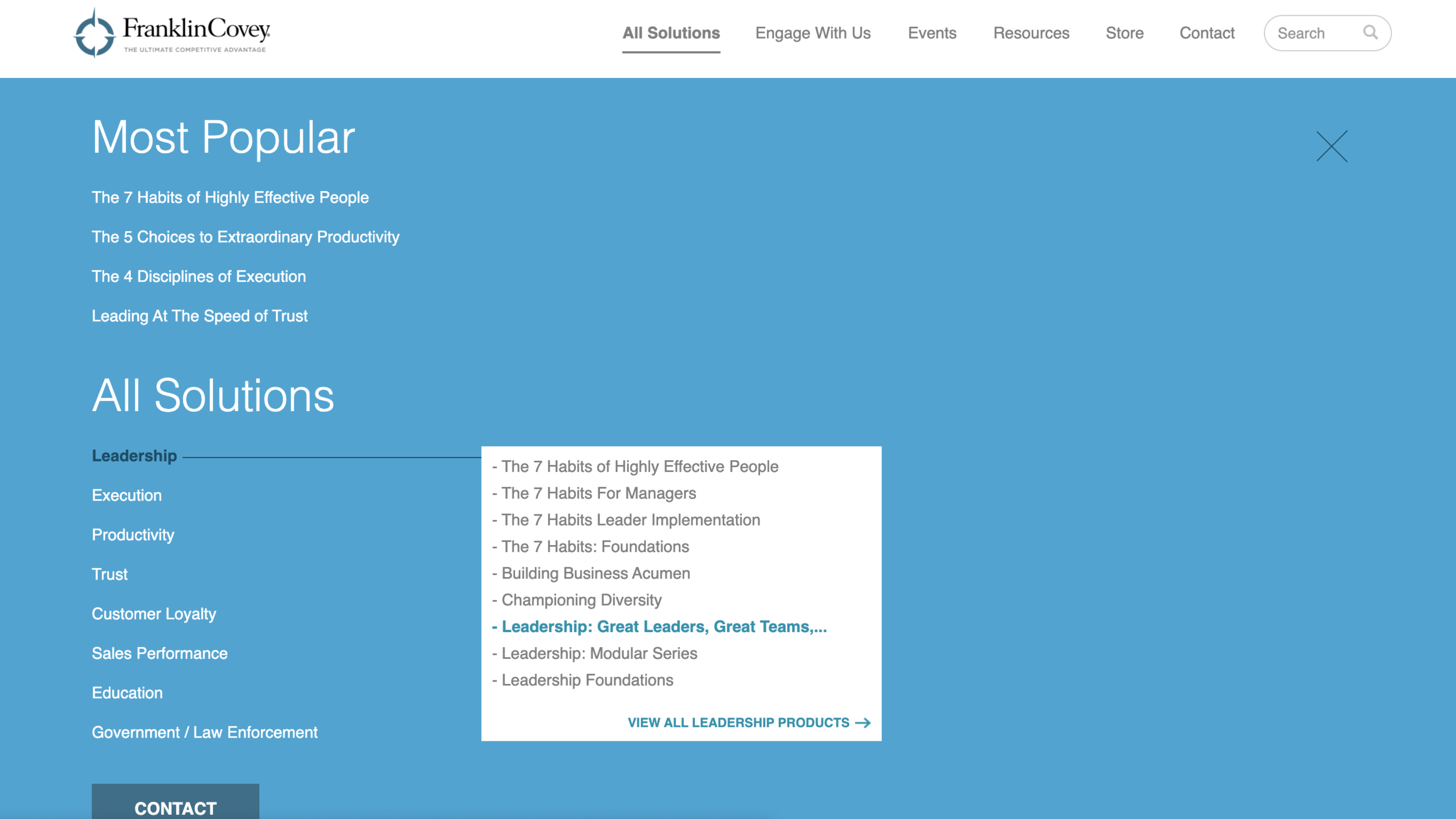
FranklinCovey has, to date, 8 product categories with 35+ products in numerous markets around the globe. These products, over time, had visually begun to run together. Lacking clear & visual distinction, each product category, or 'solution' as it's called internally began to feel confusing.
In order to shed some light on this situation, I created 'Spectrum'.
The Spectrum Brand Language, through the use of Isaac Newton's observations of the visible light spectrum, allowed me, through visual metaphor, to continue the elemental and natural philosophy of the company and embrace the nuance of each product and its colors.
By allowing each product brand color to take on their own identity and then pulling them together under one, clean, modern, white, and blue 'wave' of branded light, the brand could be all colors and no colors when it needed to be.
The goal—produce visual clarity and focus by unifying each product category beneath one dominant color and then uniting them under one unifying visual system. i.e. Spectrum.


'Spectrum' Brand Imagery
The imagery would take a macro-to-micro approach when presenting product themes and scenarios that focus on the individual.
At a high level when discussing or representing product categories, the 'individual' will be focused on and presented. As you drill deeper into the product stories the individual will come to life in business scenarios showing 'real' life, their lives, and their journey as they progress and grow throughout it.
FranklinCovey is a growth company and growth happens at the individual level so product imagery should reflect that journey.
Images selected will take on the dominant product color but until that time images would remain black and white.
This would help enforce the visual spectrum metaphor of 'coming to light' or 'come in to focus' by literally being devoid of color until the product category was selected. This would also allow brand flexibility with the treatment of both stylized and full-color images. Images dispersed throughout as examples of success. Images in black-white as examples of people on progress. Aspirational growth always.


Products, Imagery & Graphic Elements Combined
Although each product category appeared to use all the colors inconsistently across each product line, with a great deal of overlap, general themes in the brand colors were present when one would take a more macro view of the companies offerings. I.e. Leadership was generally the color blue. Execution was primarily the color navy. Trust products are primarily a burnt yellow. Productivity is primarily green. Customer Loyalty is often purple, and so on.
By leaning into the lighter, unused side of the brand palette and then selecting the dominant color appearing most frequently in product materials to become the defining product category color I was able to efficiently and beautifully create an umbrella that could house all of our products.
Spectrum Graphic Elements
The 'Visible Spectrum Wave' or 'Wave' was presented graphically as a flexible brand element that could take on the dominant product color and help to frame and unify disconnected color choices in products serving as an organic brand element for our 35+ products.


Brand Questions: What Is Your Brand Mission?
When developing a new brand there are many questions that need to be asked and answered. Here are few standard questions that I asked of myself, that others internally would ask, and were constantly asked throughout the process. My rebrand was quick so many things can be forgotten on the way but hopefully, these answers are top of mind serving as your true north throughout.
Q: How Do We Want the Brand Be Described?
A: Fresh, modern, inspiring, clean.
Q: How Would Others Describe Our Brand?
A: Fresh, modern, inspiring, clean.
Q: How Do We Want The Brand to Sound?
A: Open, aspirational, authoritative, inspiring.
Q: What Feelings Do We Want to Inspire?
A: Trust, stability, hope, courage.
Q: How Does the Brand Make People Feel?
A: Trust, stability, hope, courage.
Q: What Makes Our Brand Different?
A: We enable greatness in people & organizations globally.


Global Website: Designing Functional, Flexible Clarity
New Tech Stack
It was clear from the user interviews that we needed something inexpensive that had solid SEO, excellent integration with other platforms, a track record of performance, access to an inexpensive developer pool, and lastly could be used around the globe so we didn't have to build in multiple codebases.
After researching the top enterprise CMS platforms and doing a comparative analysis the answer was clearly WordPress Core for Enterprise.

'Spectrum' Brand Language on the Web
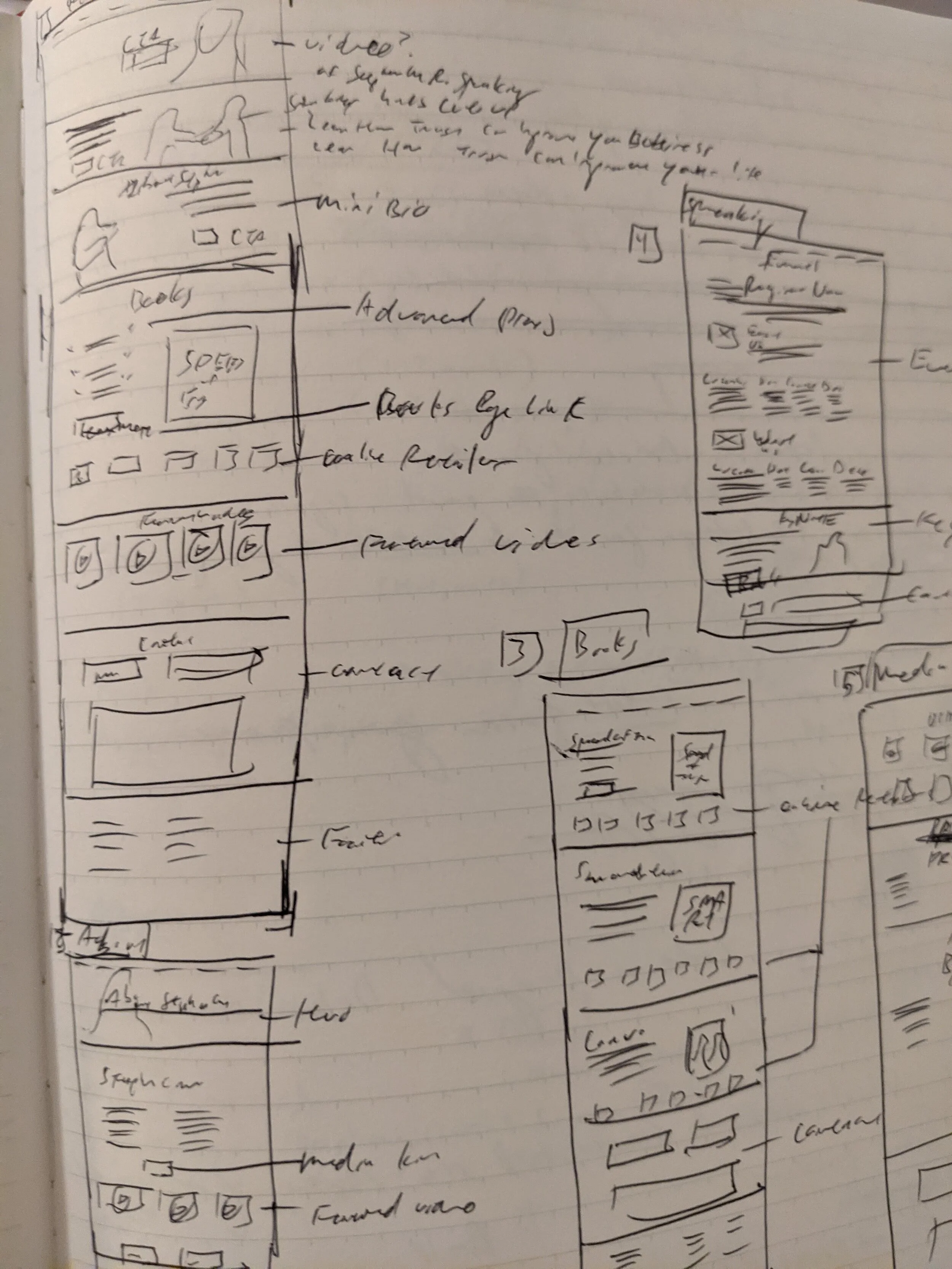
Wireframing the Website
Now that I had a functioning brand language that included imagery and graphic elements it was time to structure it out on the website and design out some usability issues on the way.
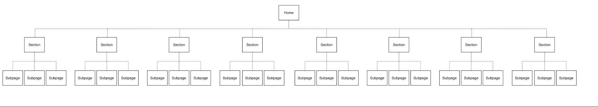
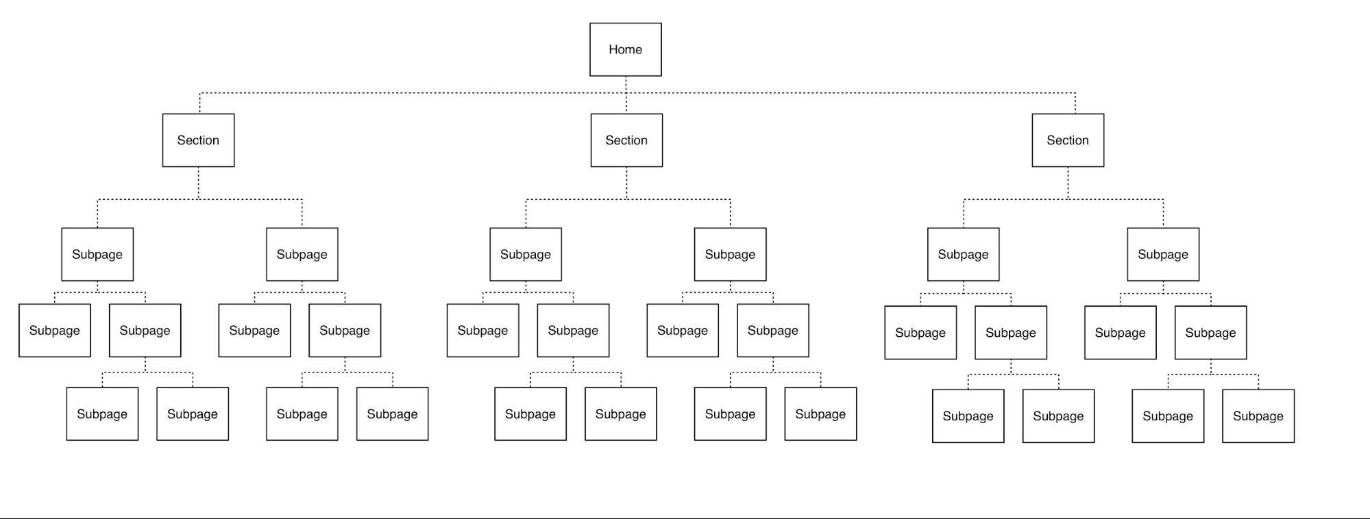
Information Architecture
After mapping out the current site and then redefining where everything should exist based on user mental models, updated language, and product approach I discovered a content story that was used on some but not all of the web pages and could work for positioning our products going forward across the entire site.
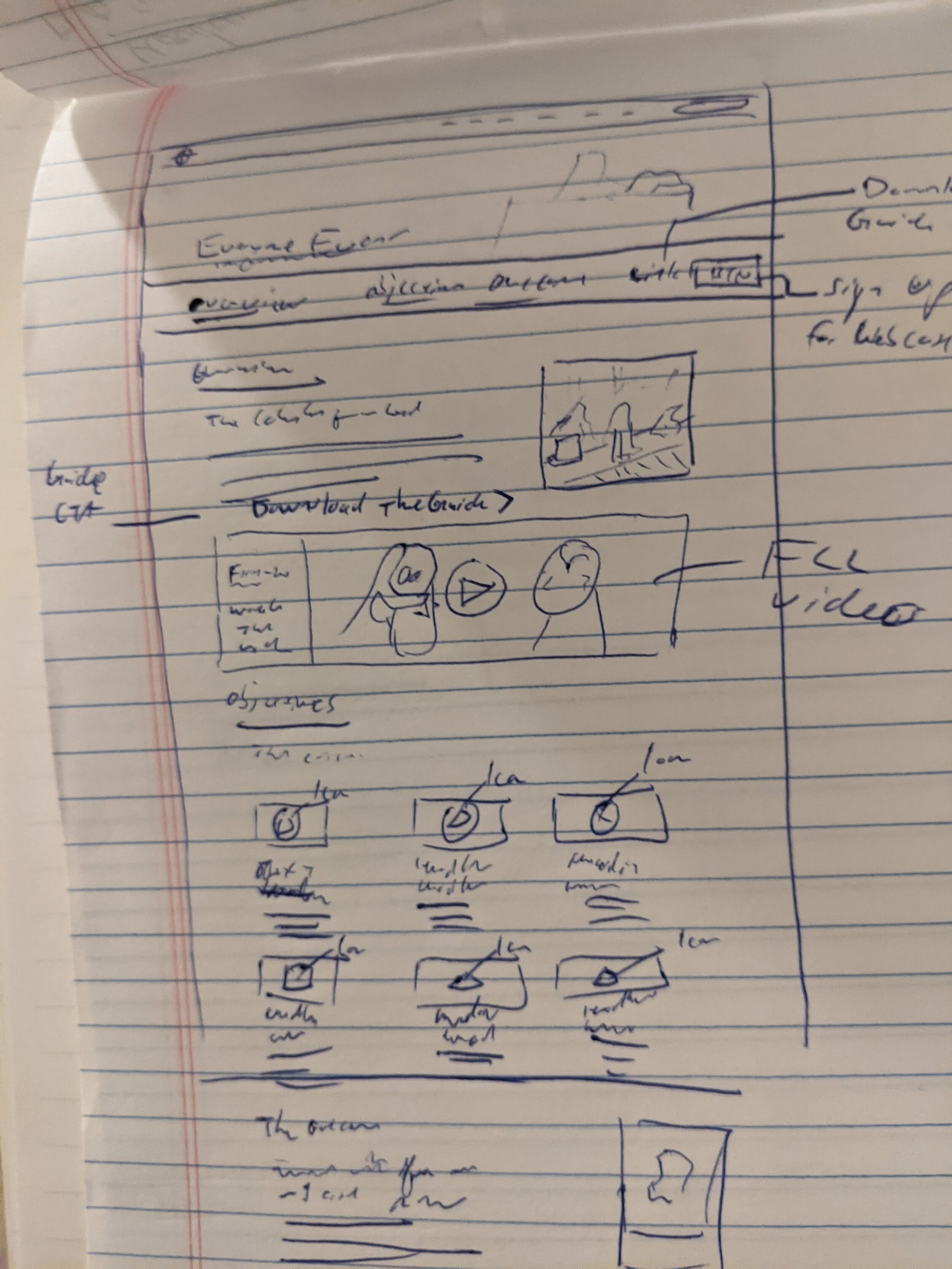
Content Strategy
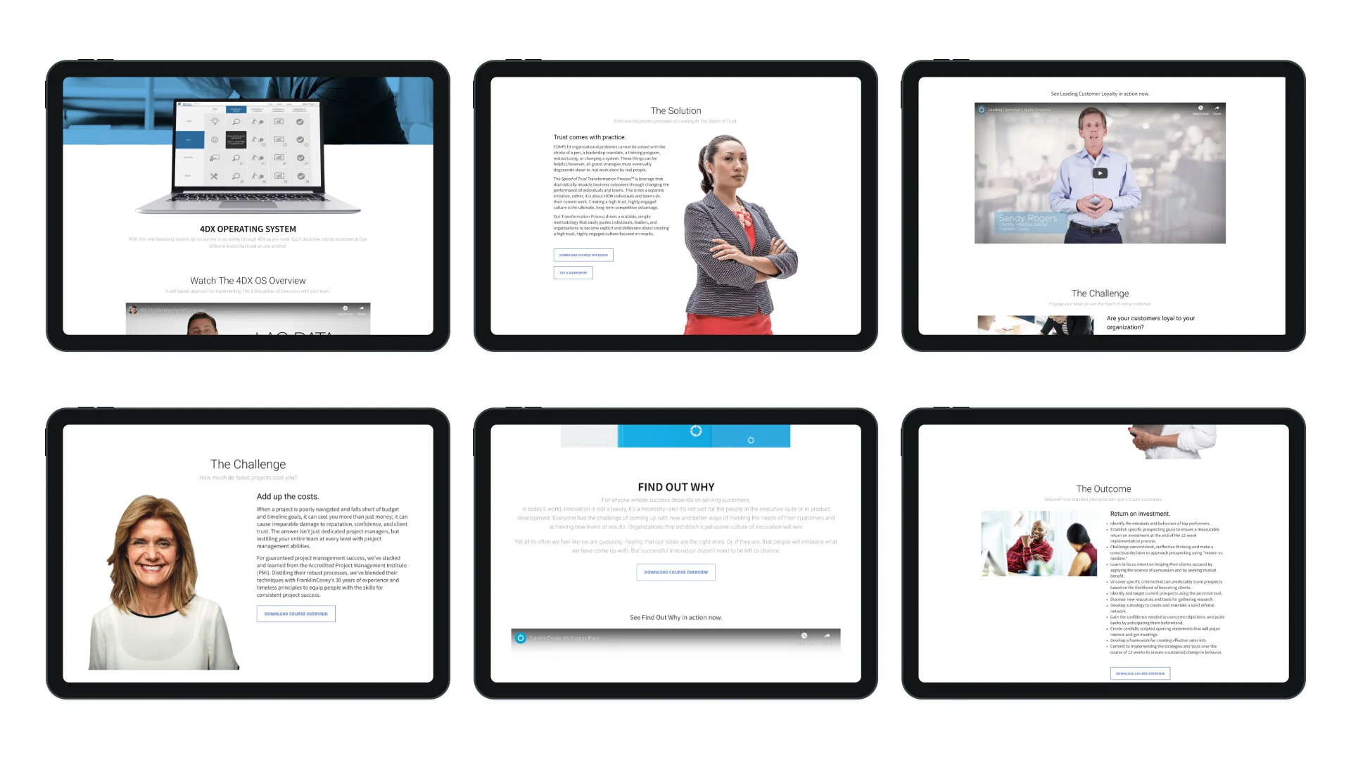
It worked in the following way: Overview, Challenge, Solution, Outcome. It was perfect for defining product values to customers and only needed to be organized across the site to stabilize through easy-to-understand, consistent, and reliable instructional design patterns. The final call to action was a contact form placed neatly at the bottom to get in touch right away.


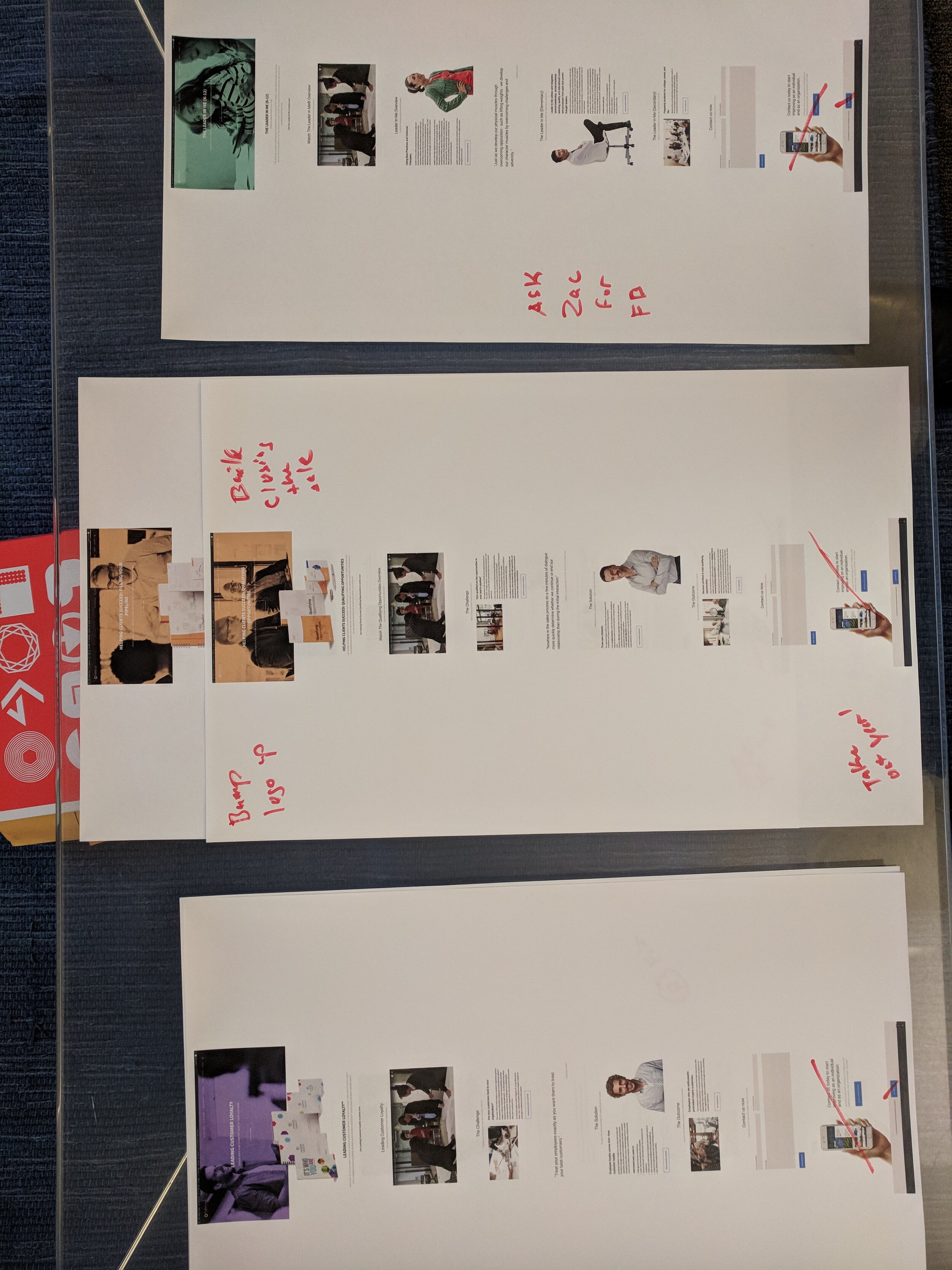
Hi-Fidelity Mockups & Prototyping
Now it was time to build some of the mockups to help us ‘feel’ our way through a prototype. We printed out 11x17 images of all of the pages on the site so we could discuss what stayed, what went, and what needed more structure.
Prototyping Solutions
Having the good fortune of developing child-themes in WordPress in the past, I was able to leverage WordPress core themes, find a fitting solution that matched most of our needs, and then develop the rest to fit our specific issues as well as problems in particular that had been revealed during discovery.
A short-list of solutions:
Usability issues regarding 'fullscreen navigation' were fixed by creating a simple on-hover event to reveal nested sub-menus without clicking on the navigation to reveal the information.
Navigation sub-menus that were hidden until clicked and was missing visual indicators were fixed by adding simple carrot '>' icons next to topics that had sub-menus. I also opted to make the sub-menus accessible on-hover to reduce the number of clicks yet again.
Small click radiuses for buttons and links which frustrated users when trying to navigate was fixed by following the MIT Touch Lab study which revealed that finger size, when used for touch screen devices, is 8–10mm, therefore our minimum target size for buttons on the website were increased to a baseline of 10mm or larger to avoid users making mistakes.


Delivery
FranklinCovey new brand and international website delivery.
The final delivery was a headless CMS option created on WordPress Core as a child theme instance that I personally built from a baseline theme. I engineered large portions of the front-end, designed and did the production for the assets, created web-friendly imagery, implemented the site, and packaged the final folder, and stored it in our BitBucket code repository for international distribution.
This included writing the developer documentation and implementation documents to accompany the packaged site to walk IT and developers through the process of staging and launching their local instance of the site.
With this package, I included all web-friendly assets to edit as necessary as well as the original sketch and photoshop documents to allow localization and graphic editing as needed.
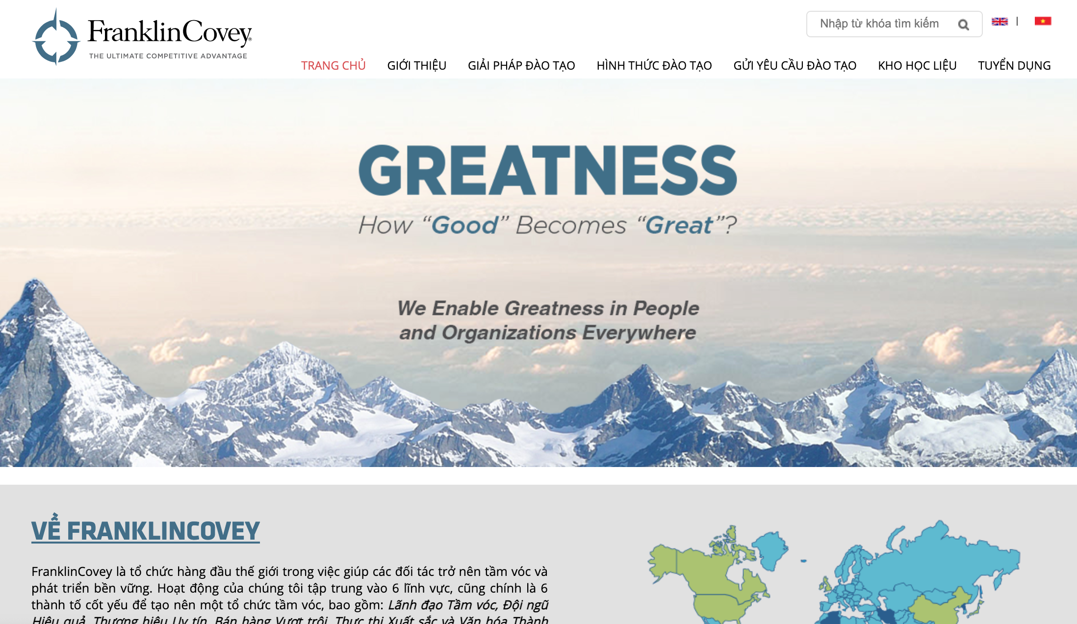
Launch
Following asset delivery, a Global Launch roll-out Zoom conference was had with participating global partners where I instructed partners of our solution and the process for delivery. The international site was then packaged up into a shareable Dropbox file that our international partners could access and provide to their development team with me serving as project lead providing technical support to local development teams globally.


Results
The goals for both the Brand and the Website were to modernize the current brand, clarify content strategy and site architecture, build an international site for our global partners, and fix the new usability issues in the process.
Key takeaways:
Immediate Results
Complaints regarding navigation usability and click radius of buttons are completely gone and a significant decrease in the overall number of user complaints through customer support has also dropped.
The stabilized site has saved considerable time through reduced error rate reduction.
The team nationally and internationally has received positive feedback from users and internally about the simplified website and modernized brand solution
Stabilized brand has allowed business to focus on growth instead of brand standards
Updated Brand feels relevant and has opened a pathway for sales when discussing product adoption to today's millenial leaders.
User Testing Long Term
Design is in constant iteration and we are always evolving the brand through customer feedback, analytics, and campaign performance.
A/B Testing page performance and campaigns has begun another evolution blending 'Spectrum' with 'Angular Focus'. The Wave elements are still in use but are slowly being adjusted to fit the new look and feel. Imagery and color use is the same but is now being filtered through evolving visual language
Google Analytics has revealed the main 'pillar pages' for the most use on the website. Leveraging the top 7 pages on the website we have introduced particular campaigns and visual tests to validate brand assumptions.
Usability tools have provided live video of users on website engaging with home page for unusual amounts of time leading to the following hypotheses leading to more tests and redesigns:
Confusion based on page complexity?
Too many things to click? The following issues lead to home page redesign to limit the number of options available in first view at any given time down to a max of (2) selections on the home page to reduce user overwhelm and complexity
Home Page redesigned for campaign performance and new marketing funnel goals.
Engineering Performance:
Since the release of the WordPress international site continued performance tracking in both AEM and WordPress creating instances of campaign sites, and landing pages to compare cost, site speed, and security led to updated technology. Recognizing the obvious benefits we switched our enterprise software solution from AEM to WordPress core as of December 2020 transitioned the US site over to match our international community and reducing the average annual cost to the company by hundreds of thousands of dollars.